


Philip Ball's Bright Earth Review
Of pigments, greatness in art, and constrained optimization problems

Post modernism in art really came into its own after cameras were perfected and widespread. At this point, perfect and true-to-eye full color representations of anything in the world were easy, and required little skill, and artists were reacting to thousands of years of representational art before them.
Bright Earth is about the time before that - when art was art, when painting required skill, and when visually portraying something was a constrained optimization problem.
How much of our world is blue or green, after all? And yet blue pigment (which you need to create many greens before synthetic chemistry) was pretty much always something like ten thousand times more expensive than white or black.
We think of pigments as child-like, simple things. You pop down to the hobby store, and buy whatever colors you could possibly desire - colors you never even knew existed - presented to you in a panspectral profusion, for a tenner.
But colors in antiquity are *hard.* The best reds, for example, required harvesting many tens of thousands of insects by hand, and processing and crushing them in specific ways to even get to the point you can start creating a pigment (usually by boiling them in lye). First the wormlike kermes vermilio, which fed on oaks, then hailing from the New World, the cochineal insect, which feeds on cactus1.
Not until you get to the age of the alchemists do you get synthetic vermilion, from sulphur and mercury, and it’s not like those reds were easy. The fact that mercury sulfide made by alchemists combining various poisonous minerals in clever ways was cheaper than insect-based vermillion or cochineal tells you everything you need to know.


“True Blues” have relied on crushing up literal gemstones for most of history - ultramarine and even Egyptian faience ultimately comes from lapis lazuli, a clue to blue’s immense cost and rarity.

Medieval art
When you see medieval art with a lot of dark blue (for the Virgin’s robes, for example), and literal burnished gold sheet used for the skies, the blue in that painting cost more than the gold (often around twice as much)2. This also touches on the “why did medieval artists suck so bad at perspective and proportions” question. The median medieval artist was an anonymous monk or craftsman, and trying to portray clearly attestable religious characters to a largely illiterate audience - the goal wasn’t faithful representation of what the eye sees, it was “legibility” and “emotional valence” and being religiously respectful and appropriate while using culturally agreed upon symbolism.

You can get various green tinged and lesser blues from azurite and other copper salts, or from grinding up blue tinted glass (called frit or smalt), but darker and truer blues were always elusive and expensive until Prussian blue in 1706,3 and later cobalt blues in 1802.

Yellows and oranges hail from various mineral sources - orpiment, lead antimonate, hematite for yellow, and realgar and cinnabar for oranges. Chrome yellow and various oranges were created after Vaquelin isolated the element chromium in the early 1800’s.
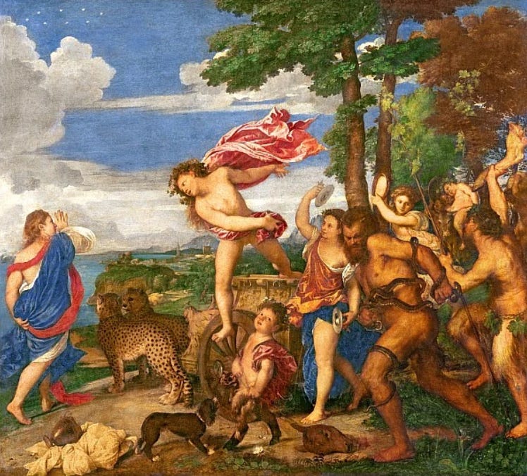
Interestingly, “true oranges” were exceptionally rare in pre-synthetic chemistry times. The orange robe worn by the cymbalist in Titian’s Bacchus and Ariadne comes from realgar, and the cape from vermillion, with ultramarine also used extensively, but most artists weren’t as well provisioned as Titian, didn’t live in an economic hub that took in pigments and chemicals from all over the world, and most couldn’t afford the (often shockingly) expensive prices many pigments commanded.4
Greens come from oxidized copper salts, like the famous verdigris green of the Statue of Liberty, or from mixing (eye-wateringly expensive) blues with yellows, until the advent of synthetic chemistry gave us (exceptionally poisonous, copper aceto-arsenite5) Emerald and later Phthalo greens.

Whites typically came from ground up bone or ash prior to the Egyptians, and from lead afterwards, and blacks from carbon black from charcoal.
You may have noticed “lead” in several of the colors there - lead alone can give you three out of four colors of the “classical palette,” consisting of white, black, red, and yellow, and of which only black can’t be made easily from lead.


Greek and Roman art
That same four color classical palette is the root of the famous black and red pottery of the Greeks and the Romans. Indeed, many Romans decried the move to a more colorful palette in art:
“Pliny bemoaned the influx of bright new pigments from the East that corrupted the austere colouring scheme Rome had inherited from Classical Greece: ‘Now India contributes the ooze of her rivers and the blood of dragons and of elephants.’6”

Today, we admire Titian as one of the peak Renaissance artists, for his color and expressiveness. And who did Titian admire? Apelles, one of the most widely admired classical Greek artists, none of whose work has survived to the present day, but who was famed for his grace, expressiveness, and skill. Yet Apelles painted within the classical palette,7 according to all that we hear of his art.8
In fact, “painting” may not even be the best word for what Apelles did, because Greek and Roman artists used either the encaustic9 or fresco10 methods. Apelles famously invented a glazing method that made encaustics even more blended, subtle, and realistic.

Renaissance art
Being an artist in the past was a serious business, requiring a good deal of chemical knowledge and a laboratory to make most of your pigments. To be an artist in medieval or Rennaissance times was to be acquainted with the practical or scientific arts. Famously, Leonardo Da Vinci, who saw no division at all between art and science, was part of a movement to raise the arts in status, by putting it on mathematical foundations, and bringing it from a mere “craft” to something that belonged amongst the “liberal arts” like rhetoric and poetry that would be taught to young nobility.

Historically, there are entelechy explosions in art. A long period of stasis, with similar styles and techniques, is superseded by a great leap forward in style and technique. The Rennaissance is one of the best known examples of this.
Great art has always been intertwined with science and commerce, as they are the milieu in which the raw materials and pigments for art flourish - we owe much of the Renaissance Old Masters’ prominence to the later stages of alchemical knowledge and the economic prominence of Venice and Florence, which served as hubs of trade and innovation, enabling the great artists living there to bring together and sample from the full spectrum of pigments available to the world at the time, as well as exchange ideas and techniques in a ferment of ideas and practices. Michelangelo, Da Vinci, Titian, Botticelli, Raphael, Donatello, Giorgioni, and Fra Angelico all produced their art in one of these two cities.

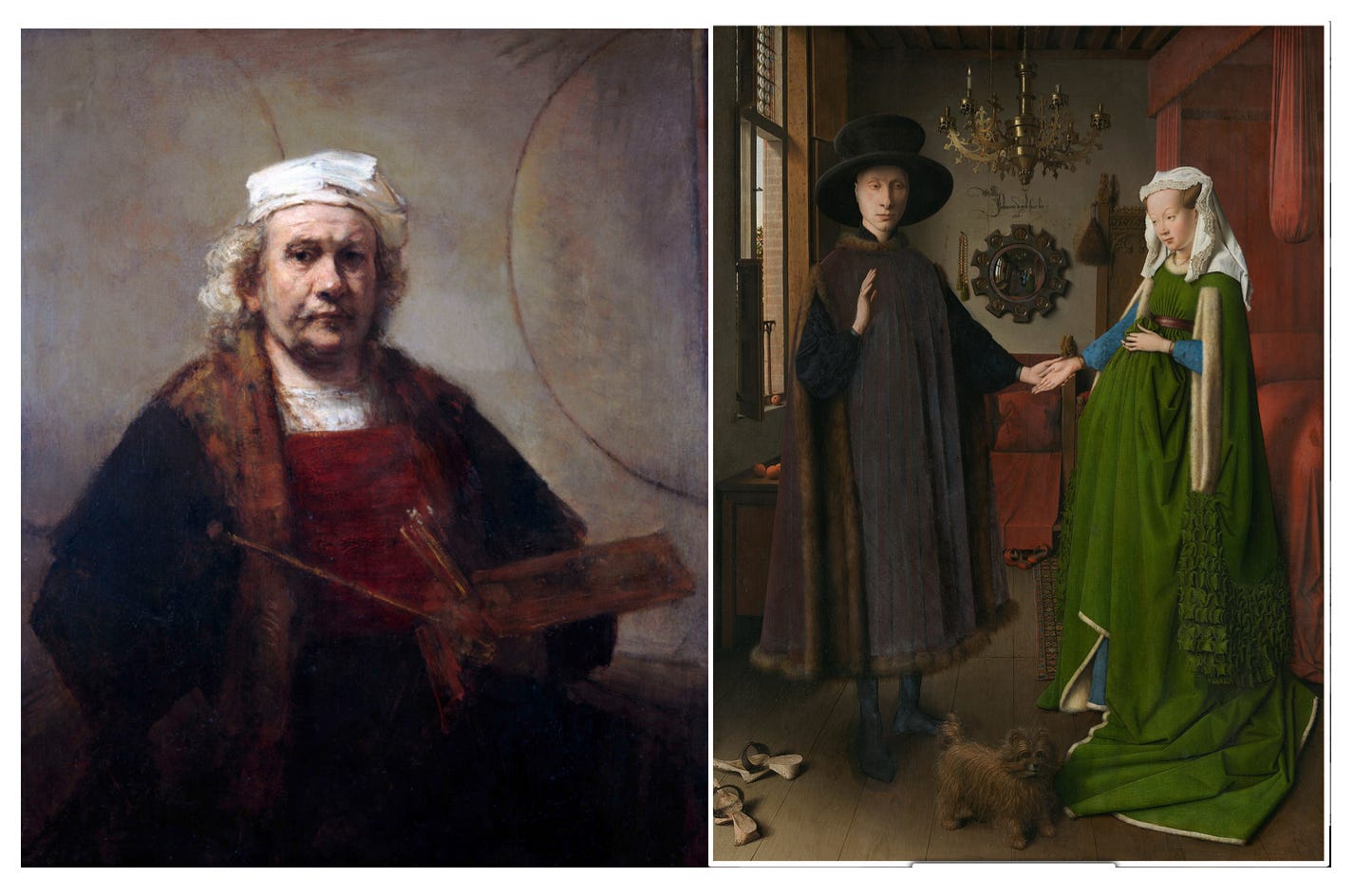
The pigments, artistic techniques, and styles perfected with the Old Masters led us to the transitional Old Masters - Caravaggio and Velasquez, then Rubens, Rembrandt and Vermeer. Now it was less about the profusion of colors available, but rather a simplification in palette with a heightening and perfection of technique, layering, and glazing, which led us to some of the most iconic works in the Western canon.


Modern chemistry era
Then between 1770 and 1820, science caught up - modern chemistry was born, elements discovered, a mad gold rush of synthesis and industrialization and commercialization ended with a profusion of new, bright and distinct colors available to the artist. Cadmium and chromium yellows and oranges, barium and copper aceto-arsenite greens, and an array of new blues from cobalt. The sharp uptick in poisonousness didn’t seem to negatively impact many painters, happily, with the possible exception of Van Gogh, who had a habit of licking or sucking on his brushes, and whose seizures, hallucinations, and depressions may have been caused or exacerbated by heavy metals in his paints.

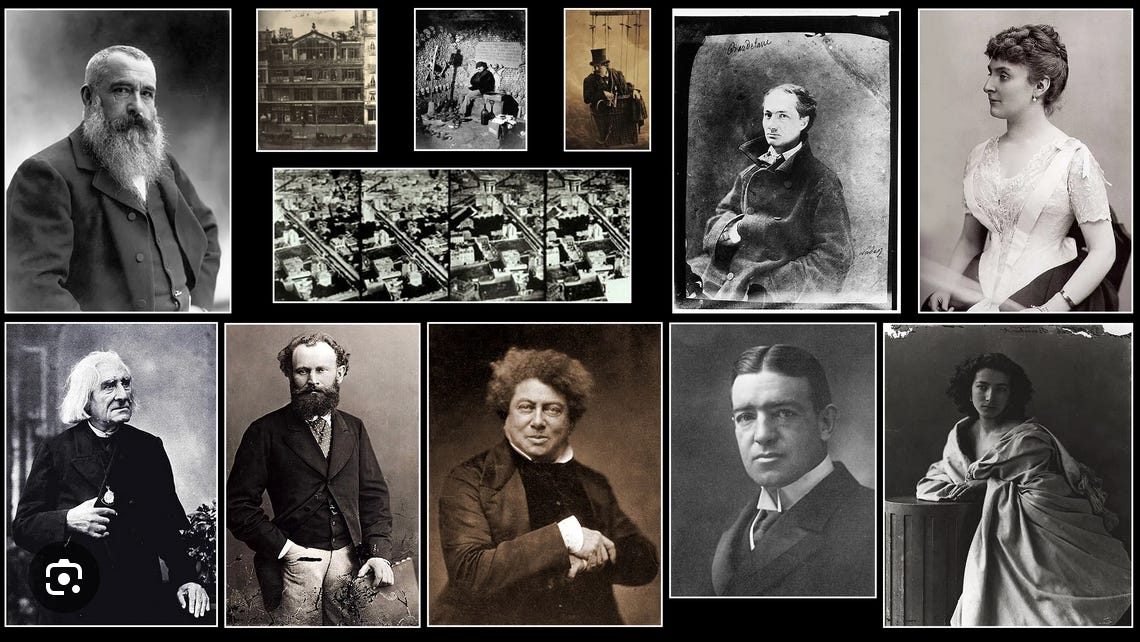
One of the most enthusiastic adopters of the new palette was John Mallord William Turner, the “Rembrandt of India,” who was of course neither born in India, nor painted Rembrandtian art, but whose appellation was a reference to the exotic and colorful palettes seen from India and the East in general for centuries. Mallord seemingly used colore exclusively, entirely sacrificing designo, and was such a fan of exceptionally atmospheric and colorful skies that he was famously pilloried by critics claiming “Sun Rising through Vapour (c. 1807)” was an appropriate title for most of his paintings. I personally think they’re quite beautiful and have always been a fan, although we don’t know how true they are to his intention today.11

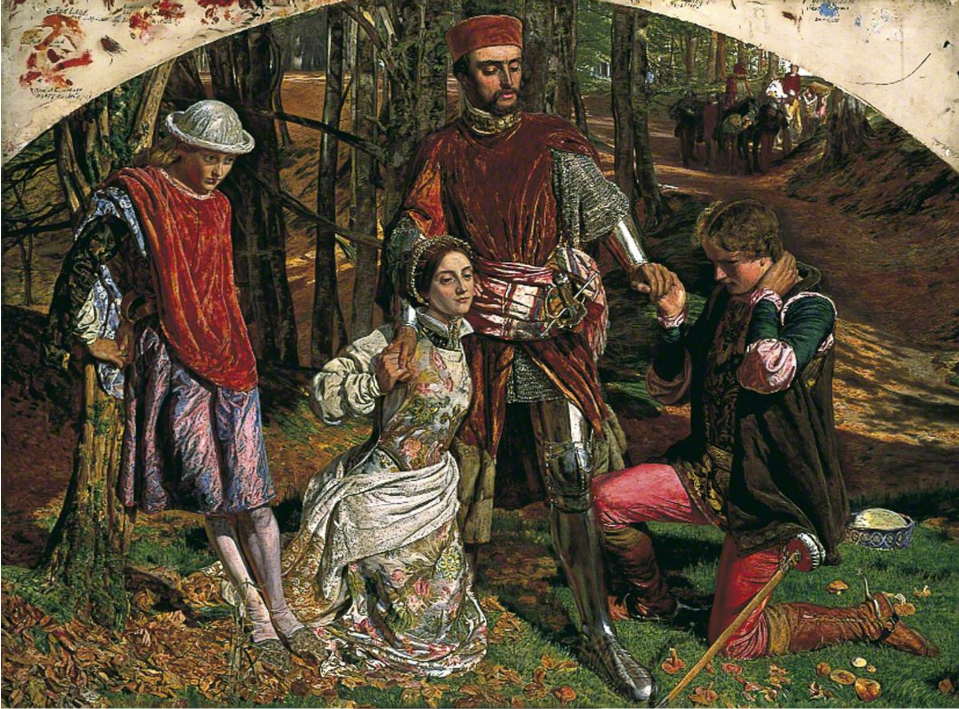
I also have to take this opportunity to bring up one of my favorite artists - William Holman Hunt, founder of the Pre-Raphaelite school of art in the 1850’s. Rebelling against the murky and thickly brown varnished style of the day, Hunt broke away from the Royal Academy to found the Pre-Raphaelite school. A master of color and vibrancy, who resurrected Old Master techniques of glazing thin coats of barely mixed or unmixed colors over opaque white grounds to ensure maximum luminosity.

Impressionism
The Impressionists took full advantage of the new pigments12 as well, giving birth to yet another artistic revolution in style and technique. They remain famous for reveling in using the purest and brightest colors, and of course pushing the boundaries of how pigments and their skilled deployment affected perception.
The first Impressionist-only exhibition,13 at Gaspard-Felix Nadar’s studio in 1874, was panned by critics for featuring impressionistic half-works that shouldn’t be considered finished (indeed, this is where Impressionism gets it’s name, from critic Louis Leroy deriding them as mere “impressions” or sketches rather than paintings).
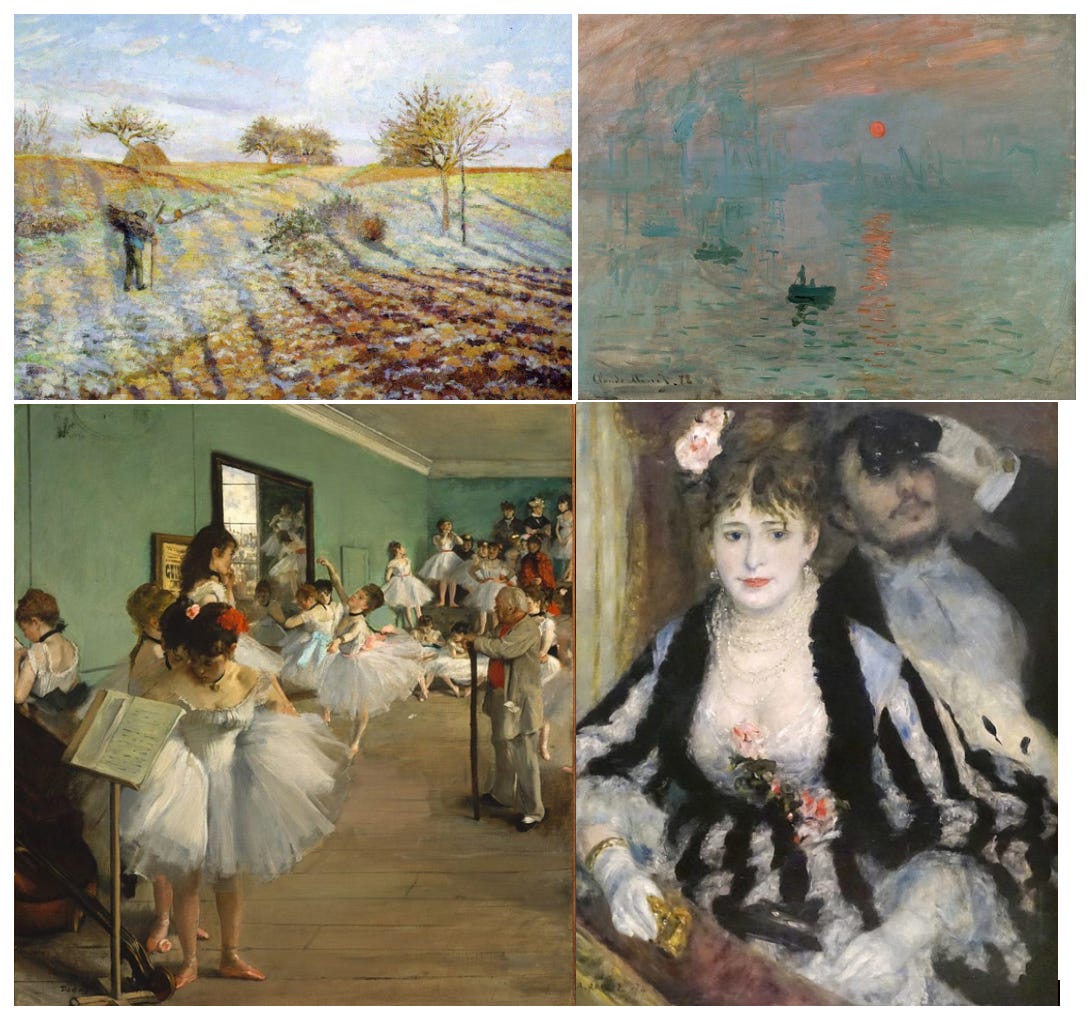
Nadar, interestingly enough, was a photographer, and it was his photography studio which the Impressionists exhibited in. Photography was invented some decades before and had become increasingly popular, and the Impressionist style, which concerned itself more with light, atmosphere, and color rather than precise detail and realism, was likely a reaction to and influenced by photography’s rise.
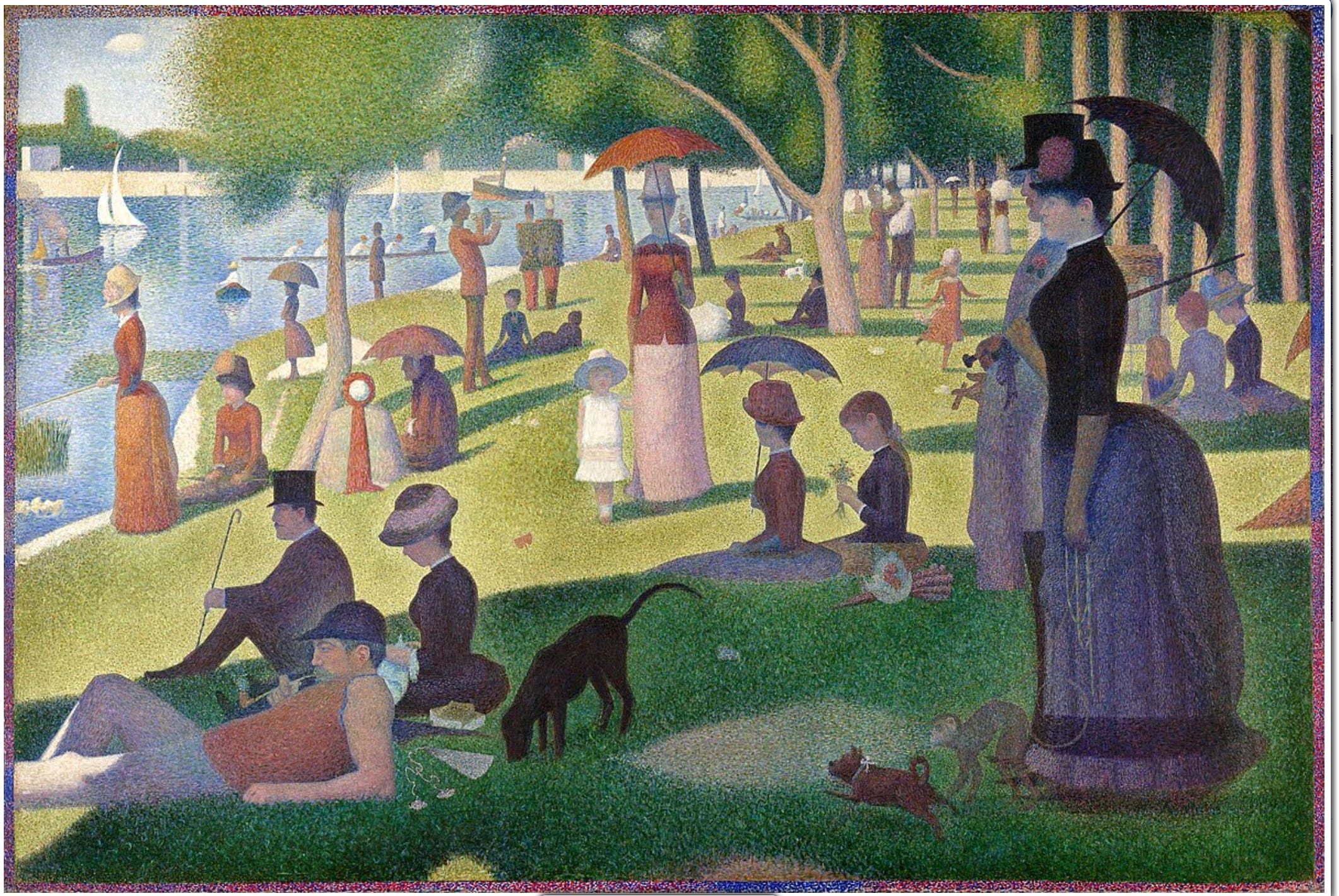
This was also a time when the science and optics of vision and pigments was being explored to a greater degree than ever before. The color theories of Chevreul, their exposition by Charles Blanc, and Ogden Rood’s Modern Chromatics all informed various ideas and experimentation around changing how the painting was perceived. The Impressionists, and later their stylistic descendants Suerat and Signac, tried a number of techniques to achieve their desired esthetic, including placing complimentary colors right next to each other to achieve optical mixing and luminance.14

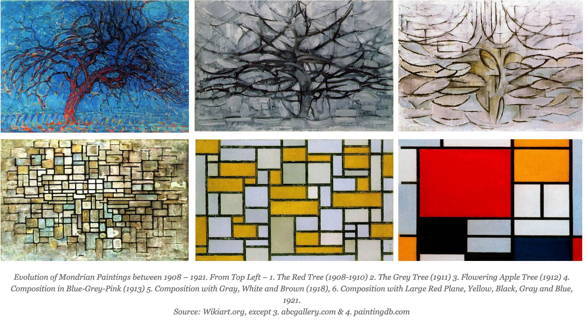
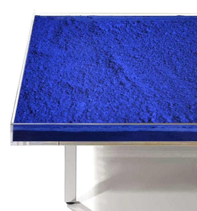
Cézanne famously pioneered the concept of “color as constructive principle” in painting, which was later taken further with the likes of Mondrian and Rothko, and finally to the extreme with Yves Klein’s International Klein Blue - three touchpoints that smoothly take us across a 200 year span, from Impressionism to Modern / Abstract to Post-Modernism.

IKB
And I’ll note here, I’m actually a fan of IK Blue. I mean, first, obviously blue is the objectively best color - even God must agree, what with making it more expensive than gold for most of history.
It’s easy to look at an art piece consisting of just pigment and think “Pie Jesu, how lazy and uninspired can you get?? Oh, was painting a few monochrome squares too much work, now you’re just skipping that part entirely? You won’t even *mix paint,* you’re just going to cart your raw materials over and call it a day? Dumb!” But Klein actually spent *years* on this.
Klein was on a search for unmediated color at it’s highest and best - he felt the binding medium of the pigments reduced and degraded the colors of the raw pigments to an unacceptable degree. He worked extensively with Edouard Adam, a chemical manufacturer, to iterate and find a resin that let the true glory of the pigments shine through. But as he created Rothko-esque canvases of textured monochrome in various colors using the new resin, he felt his audiences saw them as primarily decorative and didn’t appreciate them as an experience-in-itself in the way he intended, and so began his quest for the apotheosis of color. And of course, the reigning monarch of colors has always been blue in the history of art, so it had to be a blue beyond blue. Thus was IKB born. And he knocked it out of the park! I mean, just look at it.
Ultimately, of course, the center could not hold - once every color imaginable was available to artists, once photography was wide spread, once pigments themselves became artistic statements entirely divorced from their use as a medium, painting lost its meaning, just like written poetry lost its meaning when eclipsed by the immensely more popular and diverse sung forms in the 19th and 20th centuries.
It’s a good object lesson prevailing against the simplistic “more choice is always better” classical liberal take. In the face of an impossible abundance of choice and expressive options, we flinch and wither away into self-referential fugues of post-modernism rather than blossoming.
Only when constrained by the physical or the contextual can brilliance and creativity reach their fullest flowering. The very best situation to be in creativity-wise, pace the Renaissance Old Masters, the Pre-Raphaelites, and the Impressionists, is likely a previously constrained material equilibrium suddenly opening up into a newfound abundance, in an environment of ferment and rapid exchange of ideas with your peers (as happened in Florence, Venice, and Paris).
If you liked this review at all, Ball’s book is much like this review, with 10x more depth and detail, including forays into the pigments available to the hunter gatherers painting the Lascaux caves, the Egyptians (whose grasp of chemistry was unmatched for several thousand years), the underpinnings of digital representation of art, and much else - it’s absolutely delicious for those who enjoy the scientific and empirical underpinnings of the great art that has moved us all through the millenia.
And why did cochineal replace kermes for reds, when it literally had to come from the other side of the world, across the Atlantic? It was 10x higher yield by weight, was a more intense and vibrant red, was able to produce a wider range of reds, and when used in dyes was more colorfast.
As a rough estimate, a pound of vermillion might cost half as much as a skilled laborer would make in a year, gold an entire year, and ultramarine the equivalent of 2-5 years.
Indeed, the use of precious materials in paintings of the time, such as ultramarine, vermillion, and gold, was used in large part in the hope that the supernatural and religious potency of the works would be enhanced. The amount and grade of ultramarine and gold used were often contractually specified by the commisioner of the art, with auditors who would ensure that the appropriate materials and amounts ended up in the final work.
Prussian Blue is iron ferrocyanate, discovered when trying to mix a cochineal red, Johaan Jacob Diesbach used potash contaminated with blood in the recipe and ended with a dark blue instead of a bright red.
At the time, vermillion cost 10-15 ducats per pound, realgar was probably close to that, and ultramarine cost 50-100 ducats per pound, when a skilled laborer in Venice at this time might make around 20 ducats a year.
Which when used on wallpapers in damp conditions, released arsenic gas, likely contributing to the deaths of Napoleon, Prince Albert, and Georgias IV, the king of Greece
These reds likely from the Sago palm fruit
It is said, although there were many more pigments available to the Greeks and Romans than just 4, with 29 distinct pigments seen at Pompeii
Another reason to be skeptical that he only used 4 pigments - the Greeks, of the infamous “wine dark seas” were often rather liberal with color names, due to seeing colors as differing degrees of white and black, with luminance the main differentiator. Sinople / sinopsis could mean either red or green. Caeruleum could mean either yellow or blue. In fact, the words for yellow and blue are categorized together in many languages, including Ainu, Slavic languages, east Nigerian Daza, and Native American Mechopdo. The Latin word flavus, meaning yellow, is the root of blue / Blau / bleu, and blue was often considered a type of black given its proximity in luminance, meaning Apelles and other 4 color artists may well have used greens, blues, and more.
From Ball directly: “The Classical artist sat at no easel, held no palette board, and did not create a work simply by applying a brush to a surface. For painting on wooden panels, Greek and Roman artists used the technique of wax encaustic (from the Greek enkaustikos, ‘to burn in’). Beeswax was “heated over coals and mixed with pigments (and sometimes with resins), and the molten mixture was applied to the surface with a hot spatula. Finally, the colours were burned into the wood with hot irons held close to the paint surface.”
“Wall paintings were generally produced by brushing the pigment, mixed with a little water and gum, on to wet, ‘fresh’ plaster: the technique is now known by its Italian name, fresco. The plaster for wall murals was typically made from sand and lime. The lime binds the sand grains as it dries, and is then slowly transformed “in air to chalky calcium carbonate. The pigment is applied as a wash over the penultimate layer of wet plaster, and a final thin layer of plaster is applied over the top. The pigment becomes dispersed and fixed in the plaster as it dries. This method tends to produce colours with a slightly chalky appearance.
The fresco technique used at Pompeii, which Vitruvius describes, is very elaborate. Six coats of plaster were applied: the first three with “increasingly finer grades of sand, the final three with ground marble instead to give a hard, glossy finish. The dried wall was then polished to a mirror-like smoothness. This laborious process paid off: many of the Pompeiian murals have lasted extremely well”
For with the new colors came untested chemistry and wear properties. Paints can famously degrade in a number of ways - by exposure to air or sunlight, by reacting chemically with other paints, or by changes in molecular composition over time. The profusion of new paints was not tested by any regulatory body, and it took some time for tests, practices, and best standards to arise that ensured that most paints would endure and not change color.
With a typical palette now consisting of “cadmium yellow, perhaps chrome orange, vermilion, cobalt violet, artificial ultramarine, cerulean or cobalt blue, viridian or emerald green, and chrome green.”
Aside from the salon des refusés
The whole idea behind Seurat’s pointillism was to create an optical effect by pairing directly complimentary dots of color next each other, such that at the right distance they mixed in the retina, creating a luminous, flickering effect, as happens in optical mixing.
Sadly, it didn’t really work - Seurat wasn’t careful about the sizes of the dots, nor specifically matching pigments that would optically mix according to empirics or science, and the result is a grayish sheen at the right distance rather than the luminance he was after.